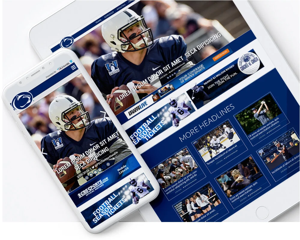
WEBSITE REDESIGN
Client: Penn State University Athletics Dept.
Project: GoPSUSports.com website redesign, 2018 | The Official Athletic Site of Penn State, partner of CBS Sports Digital.
My Role: I worked as lead designer implementing all aspects of UI. I worked closely with the PSU Athletics dept. to overhaul the design to meet their new requirements.
Objectives: Penn State University is in the top 1 percent of universities worldwide. Their athletic teams are no exception with 29 NCAA Division I teams and have won 79 national championships, including a Big Ten-best nine NCAA titles. My job was to redesign the official athletics website by giving it a fresh new feel reflecting their accomplishments.
Challenges
As the lead designer, my main challenge was to advocate for the user first while meeting the B2B requirements. GoPSUsports.com is a content-heavy information website. The contract contained remnants of archaic best practices like "above the fold" rules, making the pixel real estate very limited. Especially when numerous parties and politics are involved. It creates a call for a delicate balance between meeting everyone's requirements and needs. One big request from PSU's director on the project was to have a sizeable full-width lead news photo. While it was a beautiful modernized look, it necessitated much precious space for the remaining contractual needs. The second request from another party at PSU was to have the events and media calendar within optimized viewability. That is a clever way of saying above the fold, which has zero space left.
Solutions
A simple but essential solution was staying in communication and keeping everyone involved in the loop at every stage. One party's revision would usually affect another party's priority. Keeping everyone abreast of what was happening made each of them mindful of every edit and were more likely to compromise. With all the real estate used up above the fold, the last task was to find an optimized viewable area for the events and media calendars. Researching mobile phone UX, I discovered many features were now 2nd nature habits among users. Using this knowledge, I created an activated retractable dashboard that would remain fixed at the bottom of the website titled GoPSU Dashboard. I was able to place all the remaining calendar portals and a few extras in the new space. The events calendar is one of the sites most sought feature. Since the calendar was now tucked away in a drop-down panel, we needed to make sure the user could find it easily on the new redesign. The solution was to have the dashboard in the open position on arrival for 3 seconds before sliding down, allowing the user time to see it and show an example of its function in action.
Results
We created a new sleek design giving Penn State an updated modern feel. The site launched to good praise. Testing showed stats for the calendar in the retractable dashboard were getting equal activity from that on the previous site iteration, revealing the users were finding and interacting with it.
Fixed position dashboard while open.
Dashboard Sketches
Early alternate solution options
5 Lead Photo Stories
5 Lead Photo Stories, Horizontal layout
Transparent “glass” design with fixed background image.


